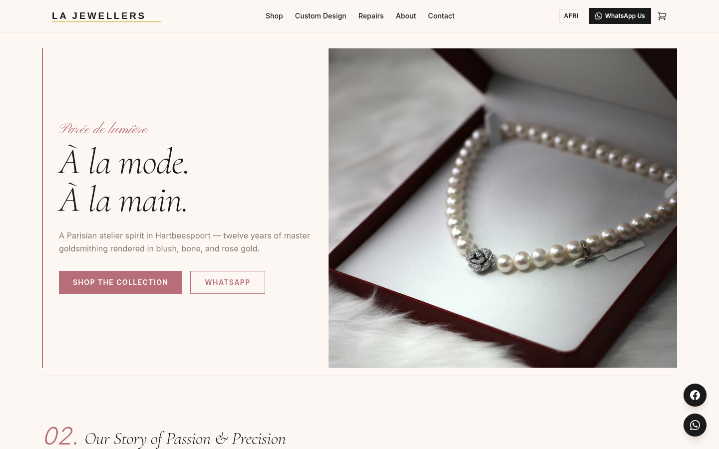
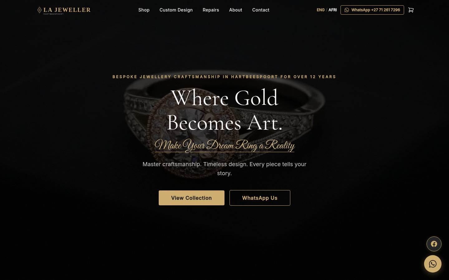
 A · Polished Modernity
01Light · Retail
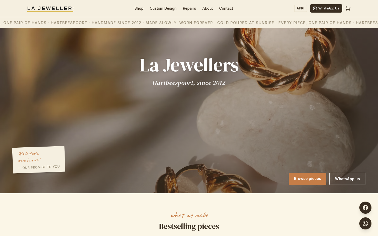
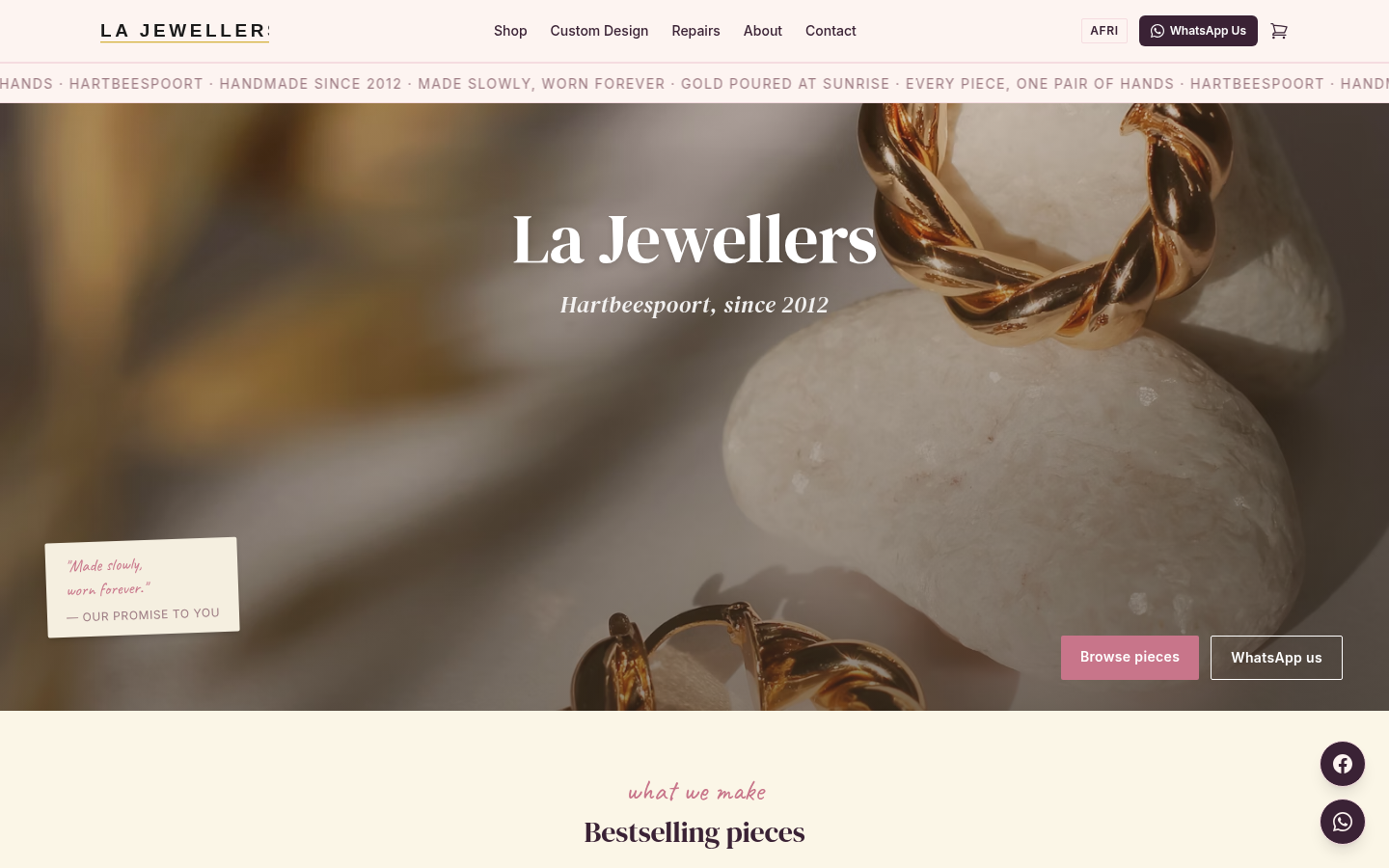
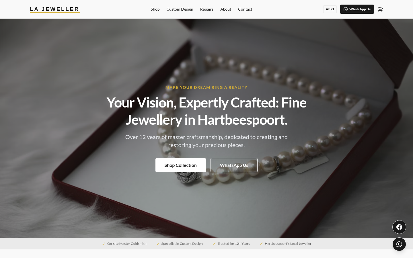
Polished Modernity
Clean, bright, high-contrast. Off-white background with a warm gold accent. Lato sans throughout. Best for bridal and gifting volume, broad appeal.
Off-whiteLatoRetail-ready